On IA Summit 2017 and Legacy

(I thought about saying something during Five Minute Madness, but so many of these thoughts were still swimming in my head that it would have come out even more disjointed than this piece is. So I did the thing I do — I sat down and wrote it instead, with some assistance from Lin-Manuel Miranda.)

It surprised a lot of people when I said this was my first IA Summit. I’ve been on the industry radar for a decade plus, but the stars just never aligned for me to come.

I was coming to the Summit while working on designing my startup’s first product, and the last month of 60-70 hour weeks had really sucked me dry.

Add in a series of unfortunate interactions in the week, a tiring drive through Seattle everyday gridlock and Vancouver rush hour jams, and my winter blues getting amplified by the drive and the interactions and the overwork.

I wasn’t really in the mood to talk to anyone.

So when you’re mentally fried, incredibly introverted, and are just barely containing yourself from throwing everything in the car and heading back south… and the ever-wonderful Abby Covert drags you out to dinner with wonderful people and tacos… it’s not pretty. You look like an immense jerk as Dan Klyn tries desperately to draw you out. And you spend the rest of the conference trying not to be that person because you feel so guilty for being that guy.

But. Enough of that.

Legacy.

IA Summit this year had a lot of very obvious, public themes revolving around “Designing for Humans.” But I kept picking at this thread the whole time I was there, one of legacy.

I’ve been working on and around the web since last century. At this point, I’m finally old enough and experienced enough that people come to me for advice, even as I’m feeling my own impostor syndrome rise when they ask. As much as I am a minor celebrity in this field, I’m still just someone who will one day be Found Out, a plumber who wandered into a fluid dynamics conference.

But this was the first time that, together, I saw what it meant to me, to those who asked for advice and coaching around portfolios, and to this field as a whole.

I saw two things, contrasting, for the first time: The words and thoughts of those who came before me (like Alan Cooper and the many evocations of Richard Saul Wurman), and the rising generation of highly trained designers and information architects behind me looking for knowledge and guidance through the mentoring and portfolio reviews. (A personal thank you to Kyle Soucy for inviting me to be a portfolio reviewer, though I’m sure it was probably an accident.)

And here I was. For the first time, I was between the two generations. I could see the two shores. The eastern shore, where the sun rises on the backs of the rising generation of UX folk, highly trained and highly eager, who will lead us into the coming decades of digital wonder and fear. And, over there, the western shore, where the giants upon whose shoulders my generation stood to help design and build the internet we know today, are going… and have already gone… into the red sunset.

I am sailing west. The western shore is no longer an idea but a distant landmark edging closer. But the eastern shore is still there, even as it shrinks and fades.

Let me tell you what I wish I’d known
When I was young and dreamed of glory:
You have no control
Who lives, who dies, who tells your story

When I was younger, I had all the time, and no time, for heroes. The Zeldmans and the Meyers and the Wodtkes and many, many others were who I wanted to be. But I also didn’t like us lionizing history. We were in a new world, with new technologies, where memes launch overnight and the technology and technique barely survive the day the same. I wanted to be like my heroes, speak with authority, have people listen, hear my story.

As I got older, I came to know my “heroes.” And I learned the honest truth — they were just as scared and fragile as I was. In fact, it started to bother me when I saw a “rock star of UX” who wasn’t authentic. I would not be them. No. Not me.

And now, here, mid-ocean between the shores… I’m still torn. Torn between the need to speak and the need to listen. I don’t think I ever have learned to do either of those correctly. But I try to do better.

Legacy. What is a legacy?
It’s planting seeds in a garden you never get to see

The seeds we try to plant in this backlit young generation are the ones we wish we’d known to plant when we were their age: Sustainability. Ethics. Empathy. Diversity.

But we planted the seeds we had, what we knew. Or we let the vines and lianas untended as we pursued money, security, the perfect taxonomy. And now we look at a world wracked by problems of privacy, of security, of “fake news.”

And so we warn them. But do they hear us? Should they even listen? Are we merely the parents chastising their children for smoking while waving a lit cigarette in their hand?

But, perhaps, they will be the ones who save us. After all, we need them to be our saviors, and we trained them up to do so.

These are the seeds we plant. We will never see them at maturity. We will not see the seeds they plant sprout after we are gone.

Now is the time for us, the ones here in the middle of the ocean, to sow. To mentor, to teach, to begin to instill those values we wish we had with us when we were their age. A world adrift in “fake news” and microtargeting needs fixing. The next generation will have many battles to come to fix the messes we leave behind, just as we worked to right the wrongs of those who came before us.

Death doesn’t discriminate
Between the sinners
And the saints
It takes and it takes and it takes
And we keep living anyway
We rise and we fall
And we break
And we make our mistakes

To the generation before us: Thank you. Thank you for being willing to trust us in perfecting what you started. Know that we demand much of you because we demand much of ourselves. We cleaned up some of your messes, but we created our own. But know we appreciate those of you who guided us along the way, in thought, in word, and in your kindnesses. We are coming behind you, and we will see you soon on the western shore.

To the new generation: Be patient with us, but demand much of us. Demand our time, demand our attention, demand our eyes and ears, demand us to speak truth and cut the bullshit. We can help you become what you will become. But know as you board your ships to lead a new generation across the sea, what you become is in your hands alone.

As Washington sings to Hamilton, history has its eyes on you.

See you on the other side.

Black is the New Black: Navigating in black and white

If you search for the latest in web design trends in 2017, you’ll see a lot of pretty reasonable sounding articles all putting together roughly the same list:

  • Animation is starting to be used correctly and tastefully
  • Mobile-first design is becoming more of a norm
  • Hero images still haven’t gone away and are getting “trendier”
  • Single-page (i.e. “embrace the scroll”) design
  • Grid-based layouts
  • Personalization (though no one could agree what it meant)

Surprisingly, they all missed one, and it’s a big one. In fact, I’d argue that it’s almost as big as Hollywood’s obsession with orange and teal. I call it “Black is the New Black” and it’s the proliferation of dark grey or black text on a white or light grey background as navigational elements.

Let’s take a look at the global header and global navigation for some of the top websites in the United States as reported by Alexa:

1. Google

Google's website header as of March 19, 2017. It is black text except Google logo, and the selected item in the global navigation menu, which is blue. The selected item also has a blue underline.

2. Youtube

The Youtube global header as of March 19 2017. Except for the red in the company logo and the user's profile, all elements of the header are black or grey.

4. Amazon

Amazon's global header as of March 19, 2017. Below a row of images representing products, the brand channel is a very dark blue with white text for the global navigation. The sub navigation directly below is black on white text. Very few elements contain color.

9. eBay

Ebay's global header as of 19 March 2017. After a bright green advertising bar at the top, the global header is fully black on white text with the exception of the eBay logo and the calls to action to sign in or register (which unusually, are on the left side of the screen).

10. Netflix

Netflix's global header as of 19 March 2017. With the exception of the Netflix logo and the chose menu, all elements are white on a dark grey background. We know it's dark grey because when the menu's open, it's an even darker shade of grey. Chosen elements are red on black, which I'm sure makes a certain colorblind subset of the population thrilled since they can't see it.

All of these brand and navigational experiences have a few things in common:

  • They use almost no color in the global navigational elements
  • The chosen element’s state of being chosen is illustrated through a change in font weight or border
  • The navigation bar is almost indistinguishable from the brand channel (where the brand tells you who they are, and often where the search elements hang out) or the utility bar (where top-level utilities like “messages” or “log in / log out” are located.

It’s not surprising that designers would want to understate their global navigation; I think we can all agree that we don’t want the global navigation to have a stronger visual hierarchy than the content of the page. Picking a limited but accessible color palette such as a white background with dark grey text or a dark grey background with white text accomplishes these goals.

And in the era of “flat design” it’s not too much of a surprise that the navigation menu looks neither like a row of file folder tabs nor like a row of gradient-decorated buttons. There’s something very sleek (or maybe naked?) about a row of links floating in space.

But there are also problems.

It’s breeding like bunnies

(Incidentally, I raised rabbits as a kid and it’s harder to get them to do that than you’d think, but I’m going with the metaphor anyway.)

The examples above concentrate on strictly the global navigation, but that’s not the only place Black is the New Black is showing up.

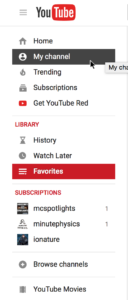
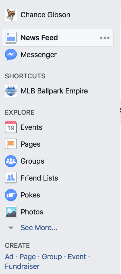
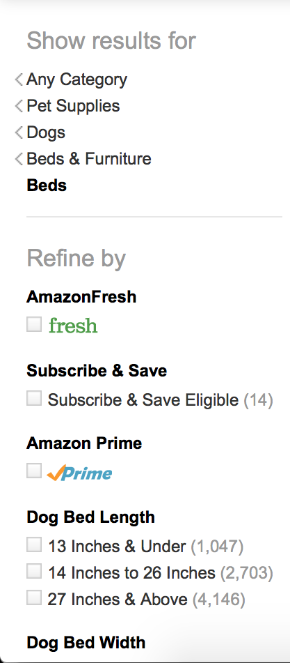
Youtube, Facebook, and Amazon are all using black heavily in their local (left-nav) navigation bars:

Youtube's left navigation column as of 19 March 2017. The choices are black on a white background, the hover state is white on a black background, and the selected item is white on a red background. The subheadings are red on a white background, though.

Facebook's left navigation bar as of 19 March 2017. It is black text on a light blue background, with black headers. The selected item has an even lighter blue background with black text.

Amazon's left navigation bar as of 19 March 2017 (on my account, anyway). Technically this is more of a filter because it allows the user to view the breadcrumb of categories that brought them to the current page then manipulate a bunch of checkboxes to change the result set. Still, the headings are light grey and larger than the subheadings, which are the same color choices as the itnteractive elements except the subheadings are bold. Only brand elements like the Amazon Prime or Amazon Fresh logo are in color.


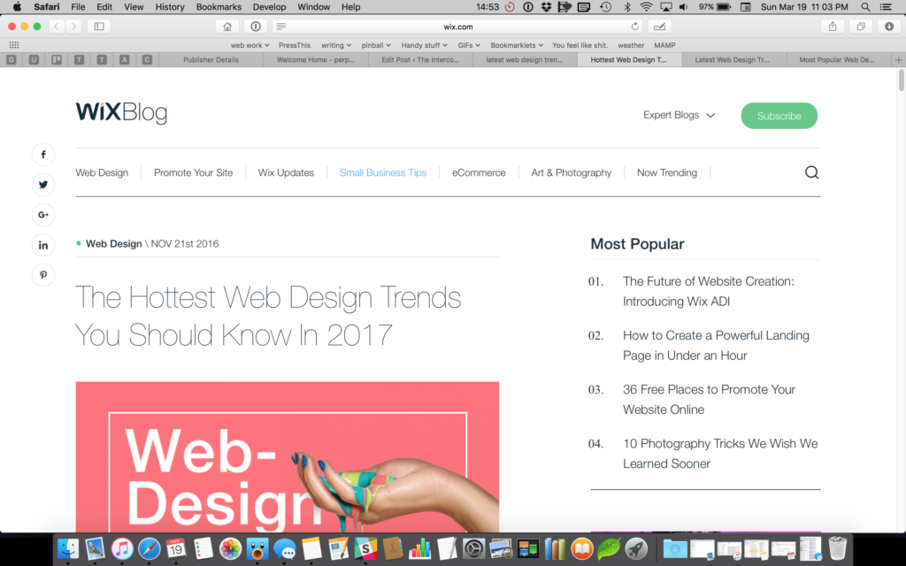
Wix is using black on their Most Popular list as well as their global navigation.

A screenshot of Wix as of 19 March 2017. The global navigation uses black text on white for active items and blue text on white for the selected item. The list of "most popular" articles is also written in the same black text as the header and the body copy.

Alexa is using white-on-dark-blue for their global navigation and black-on-white for their in-page navigation.

The header of the Alexa website, which ranks the popularity of other websites (among other things) as of 19 March 2017. The header is a dark blue with white text, and the in-page sub navigation tabset, which in this case allows the user to toggle between "world", "country", and "by category" is black on white with a blue bottom border and bold text for the selected item.

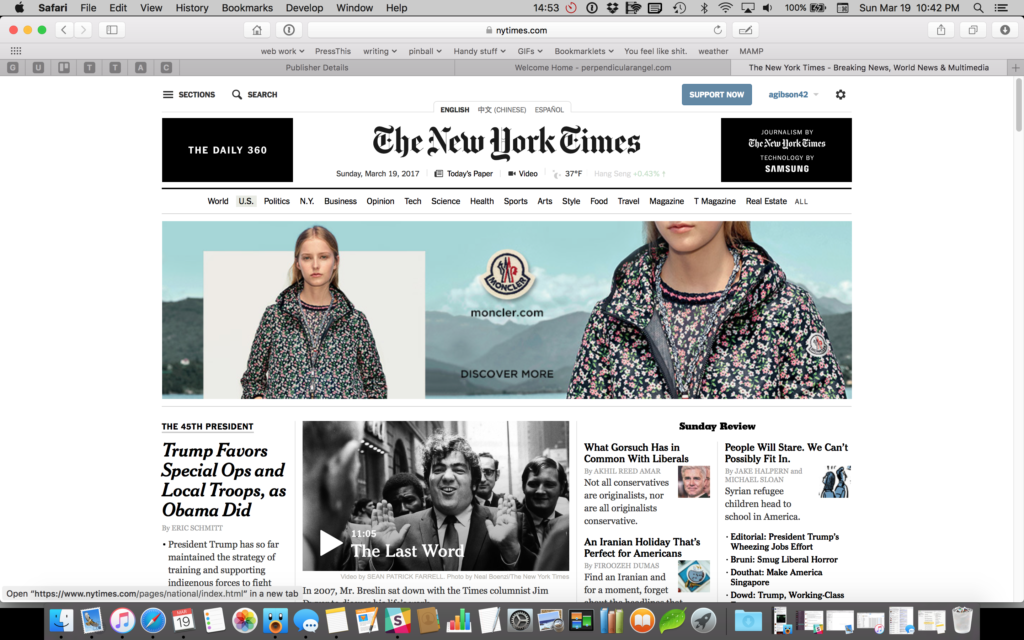
And then there’s the New York Times:

The homepage of the New York Times as of 19 March 2017. There is no text on this page whether global navigation, in-page navigation, or body copy, that isn't black on white.


There is nothing on this page written in text, clickable or not clickable, that isn’t black on white.

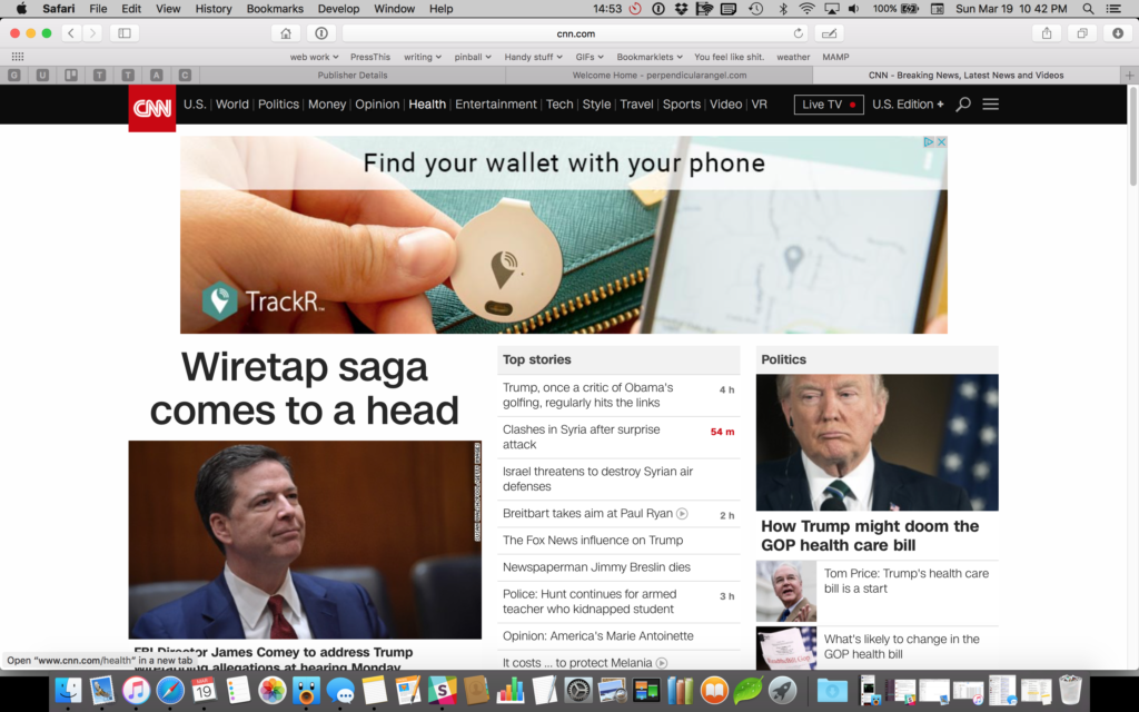
Okay, okay, so maybe she’s called the Grey Lady for a reason and it’s a purposeful decision to cast away usability just to look like the newspaper. But CNN was never a newspaper, and they followed suit:

A screenshot of CNN's homepage taken 19 March 2017. Following the trend, nothing on CNN's website is in color except the CNN logo and the timestamp on one news article that occurred less than an hour ago. (But only the timestamp, not the title.)


If we had only been seeing this trend in the global navigation, we could’ve argued that people know global navigation is interactive because almost all websites place their global navigation in the same place, and it’s a learned behavior.  As the trend spreads from global navigation to local navigation to in-page navigation to plain old links, the amount of cognitive load the user needs to use to determine what’s interactive goes up significantly.

It’s difficult to tell the state of an element

For most of these examples, the primary global navigation is a tabset metaphor: you’re looking at one set of data under a specific category. If you didn’t come in the front door (thank you Google) or you have forgotten how you got to where you are, the global tabs provide you with a sense of environment and direction: here’s where you are, here’s where you can go.

So if the navigational elements don’t look like they have a specific state set, it can be confusing for the user to orient themselves. Amazon’s design  is probably the most difficult to use. Neither the global navigation nor the subnavigation change regardless of which category you’re viewing. Where are you on Amazon’s site? Who knows? Just search again and hope you get somewhere useful.

There’s also the question of number of states. For global navigation on externally-facing websites we generally only see two states: active (which means you could select it) and selected (which means you already did). On internally-facing websites or applications, though, we frequently have a third choice for disabled tabs.

Why would you display a navigational element a user couldn’t access? One reason may be because you’re in tech support and you can see other people’s accounts but not modify them — you may still need to tell Mr. Smith where the Private Data tab is located even if you can’t view it.

Internal employees providing wayfinding for other users, whether they’re internal or external users, is the most frequent use of disabled navigation elements, but I’ve seen others in the wild. Sometimes to gain access to secure content, the user has to take other steps first, which could even include plugging in a dongle or drive. Sometimes authentication is required. Sometimes it’s a vendor product and it’s just what you got stuck with.

At any rate, if the user needs to know the tab exists but can’t use it, it has to have a disabled state. And therein lies a problem: if the selected state is grey and the active state is a different grey, what color is the disabled state (which is traditionally grey)? One could argue to introduce a third lighter grey, but then one has to be careful to make the disabled grey different enough from the active grey to look disabled while also not making it so light that it no longer fails color contrast testing for accessibility.

(Incidentally, I did have someone argue once that disabled items don’t need to be readable. Hogwash. Either you need to know what’s disabled, in which case they need to be readable, or you don’t need to see them at all.)

Let’s say that we find a suitable grey or font weight or something that differentiates disabled from active or selected. Great! Now we just need to solve the problem two more times, for the hover state and the focus state.

There is only so far that we can stretch font weights and underlines and borders if we limit ourselves to a greyscale navigation system.

It matches the body copy

In almost all of the cases cited above, the body copy for the site was the same color or nearly the same color as the navigational elements. If everything’s the same color and weight and nearly the same size, what’s clickable and what isn’t?

I’ve heard many a designer over the years claim that a user will explore a page and click on things to see if they do anything, but my experience in usability testing points otherwise. People don’t click things that don’t look clickable. As Jakob Nielsen says, “Life is too short to click on things you don’t understand.”

“Just click it to find out” on an iPad using a cellular connection on a train is not exactly the speediest way to explore a website.

I’ve hear designers and developers also justify decisions like this by “the cursor will change when they hover over it”, which may be true if the user is using a mouse, but fails miserably for my iPad. Hover states are not guaranteed and can’t be used as a primary affordance.

Finally, I’ve heard the case that users are smart enough to understand that something is an article title or breadcrumb or link just by what it says and will click because they understand what they’re looking at. That works fine for experienced web users, but for young people, those with cognitive disabilities or reading difficulties, or people who are reading in a foreign language, the affordance of a change of color or other indicator that something is a link may be the same affordance that helps them understand the words are an article title.

Affordances are important

Clean simple designs are important to ensuring that our users put the bulk of their thinking on the content we’re presenting and not the navigational framework around it.

At the same time, there are critical reasons to make interactive elements stand out from their non-interactive brethren: mostly that we want our users to interact with them.

We want the choice to click on something to always be successful. We want the user to trust the interface. We want to communicate state, not only by the context clues of the surrounding content, but by the visual and structural display of the content itself.

To that end, not everyone’s global header has to be black text on a white background (or vice versa). It’s not only okay to be different, but when designed well, it will give us a more effective design than those following Black is the New Black will be able to boast.

Navigation elements should always clearly communicate their state.

Links should look different from body copy, even if the link is to the side of the page or above or below the body copy.

Text should have significant enough contrast from its background and its neighbors to both read it and understand the affordances it carries.

Most importantly, there’s more than three colors in the world, and we should not be afraid to use them, especially when it results in a product that’s easier for our users to understand.


2 projects, 2 elections, 2 soundtracks

Since I got my first music cassettes and my first walkman, I’ve become obsessed with specific albums and just listened to them over and over. Music became entangled with specific people, places, and events. Raking leaves in mom’s side yard: Born in the USA. Riding the bus to school: Fascination Street. Walking through north Tacoma: Hunky Dory. Working out at the college gym: Achtung Baby.

As an adult, soundtracks followed me into my working life. Twice now, my work soundtracks have set themselves along with turning points…

Tones On Tail, Summer/Fall 2000

I’m fired up on A List Apart & Webmonkey articles, and learning enough CSS to think, yeah I could totally redo this site to go with the redesign that my boss wants to go with the “rebranding” we’re doing.

Meanwhile, I rip the CD I just got onto my computer; my sweetie has been introducing me to lots of different New Wave/post-punk that I missed because he’s four years older than me. It’s fierce and poppy and jangly, and I love it.

Time to fire up Winamp and blare Tones on Tail over and over while trying to figure out how to do an unholy hybrid table/CSS layout. Oh, and my first stabs at ASP to run a searchable database web thingy.

Not too long after the project is live, while I’m cleaning up odds and ends, fill out my “permanent absentee” ballot, waffling madly between Gore and Nader, and drop it off in the mailbox downstairs. Six weeks later, I’ll be at a new job with new web problems…and the election still won’t be over.

The President’s 2016 Summer Playlist (Daytime), Fall/Winter 2016

We finally get the go-ahead to go forward with the CMS migration I’ve been picking at for over a year. Time to put on the headphones, then.

All the content types. All the views. A theme that looks exactly like our current site, so hopefully no one on the outside will even notice. Editor roles, author experience options. Settings. And then the complicated stuff.

And then this delightful energetic mixtape from Obama. Almost perfect for just dropping into the flow. So I’m singing aloud to Jidenna and Aretha Franklin while yelling at code.

Summer moves into fall, an election approaches, and “we’re going to spend election week finishing up this thing.” But it takes longer than that, because it always does. And an election I was sure about curdles into something else, and music that was about fun becomes a source of defiance.

It looks like Spotify copied that list over into an “Obama White House” account, but I made my own copy, because now everything is off-kilter and uncertain.